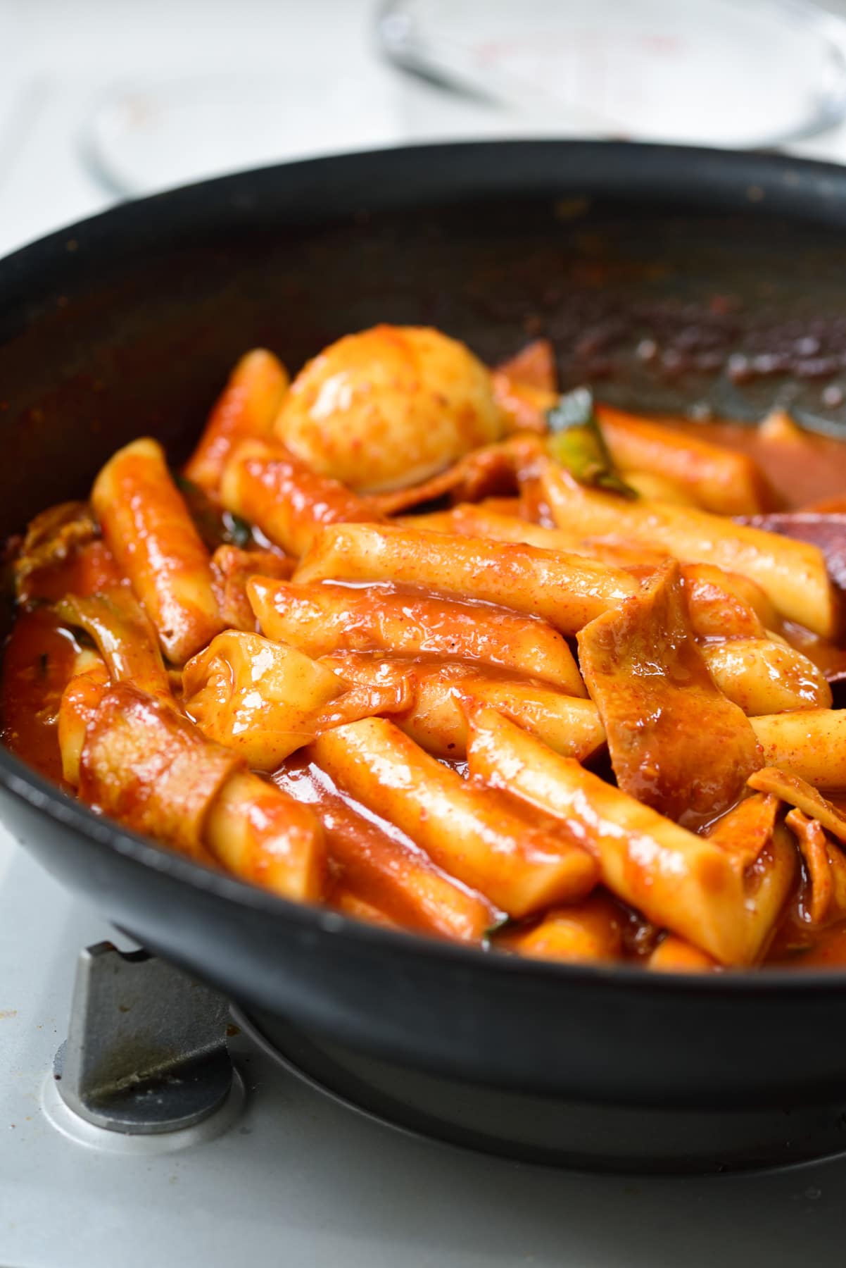
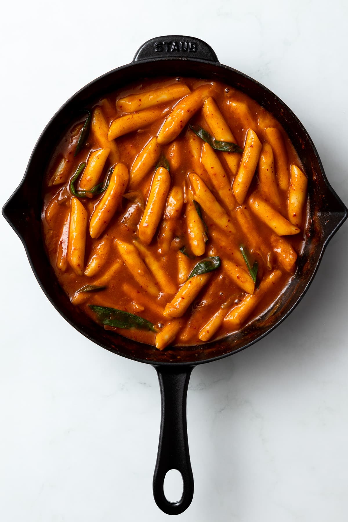
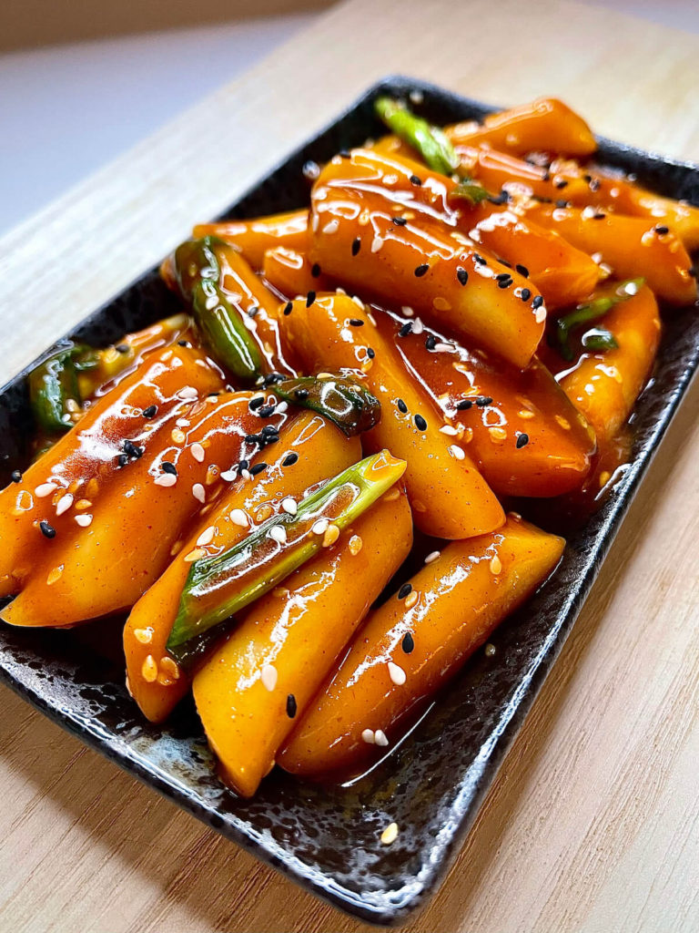
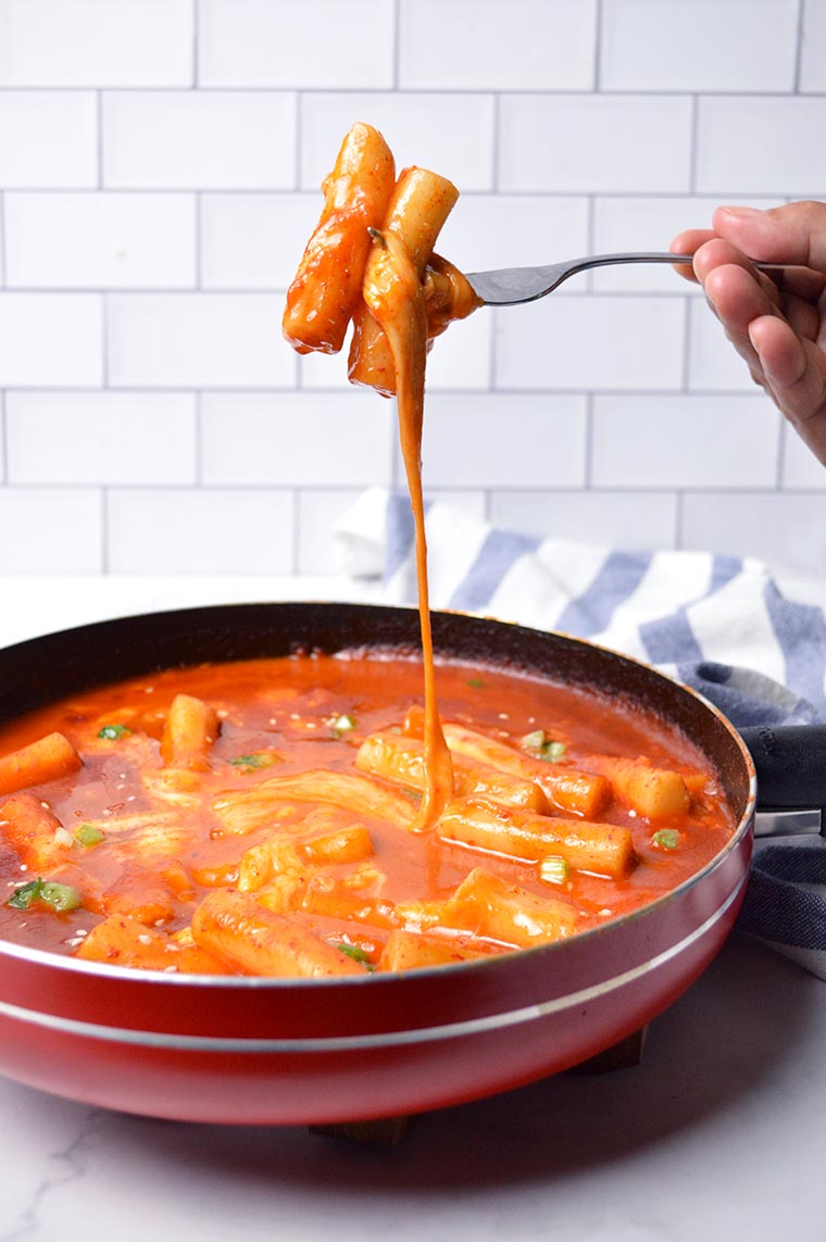
INGREDIENTS:
a. 350g / 12 ounces Korean rice cakes, separated
b. 150g / 5.3 ounces Korean fish cakes, rinsed over hot water & cut into bite size pieces
e. 2 cups Korean soup stock (dried kelp and dried anchovy stock)
d. 60g / 2 ounces onion, thinly sliced
e. Sauce: 3 Tbsp gochujang (Korean chili paste), 1.5 Tbsp raw sugar, 1 Tbsp soy sauce, 1 tsp minced garlic, 1 tsp gochugaru (Korean chili flakes)
f. Garnish: 1 tsp roasted sesame seeds, 1 tsp sesame oil, 1 stalk green onion, finely chopped
STEPES:
1. Unless your rice cakes are soft already, soak them in warm water for 10 mins.
2. Boil the soup stock in a shallow pot over medium high heat and dissolve the tteokbokki sauce by stirring it with a spatula. Once the seasoned stock is boiling, add the rice cakes, fish cakes and onion. Boil them a further 3 to 5 mins until the rice cakes are fully cooked. Then, to thicken the sauce and to deepen the flavor, simmer it over low heat for a further 2 to 4 mins.
3. Add the sesame oil, sesame seeds, and green onion then quickly stir. Serve warm.
I got this information from: source.
RECEPIE WEBSITES FOR REFERENCE:
source 1: pinch of yum;
What grabbed my interest was the arrangement of the categories, particularly the ones presented in smaller circular shapes. The shorter articles and blogs were thoughtfully positioned towards the lower part of the page, enabling users to scroll down and access them in chronological order.
source 2: skinny taste;
The website's design closely resembles the one above (Pinch of Yum) in its layout. Additionally, it features a category list and images displayed within small circular frames. What's great to see is the provision of cooking duration, nutritional details, equipment requirements, and other essential information in a distinct box.
source 3: food network;
This website showcases creativity in its design but doesn't quite meet its intended goal as a food recipe-focused platform. It prioritizes articles and blogs excessively, dominating the initial screen space and pushing the menu bar options to the side. Unless users actively search for ingredients or navigate through multiple buttons to uncover recommendations, they might feel a bit lost.
NON-RECEPIE WEBSITES FOR REFERENCE:
source 1: bear necessities;
A critique that I have for this website is to have more consistent image size. It looks a little messy with the inconsistent photo sizes. I like how there is a vertical list of items on the left. It is easy to search throug the categories from top to bottom.
source 2: snapchat web;
it's great to have a list of chat history displayed on the left side. Any feature that organizes history into a list is excellent for keeping track of search history and building a personalized list.
gucci's website has its' spcific clean and minimalistic style. it looks very modern and stylish without too much effort.